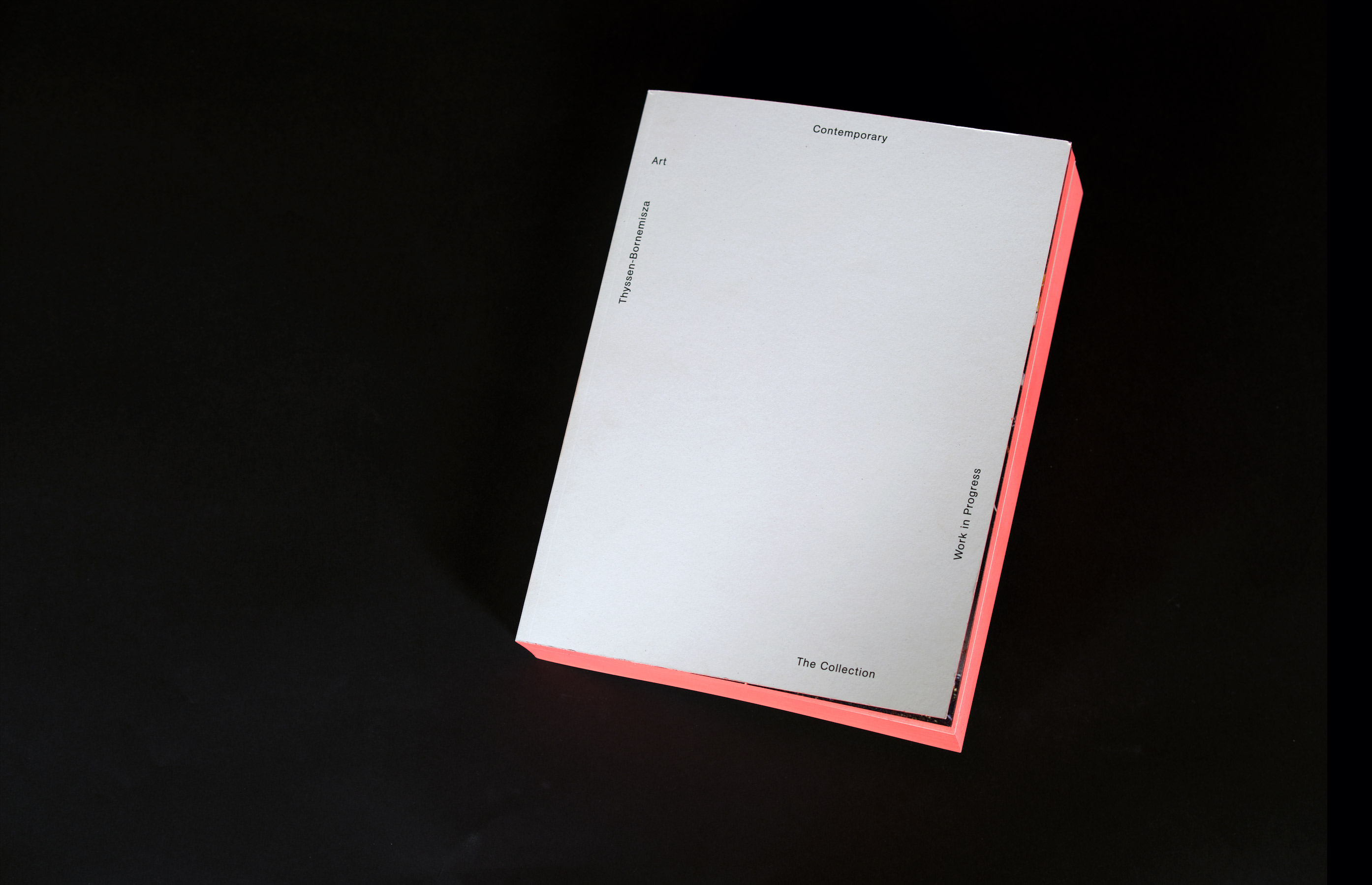
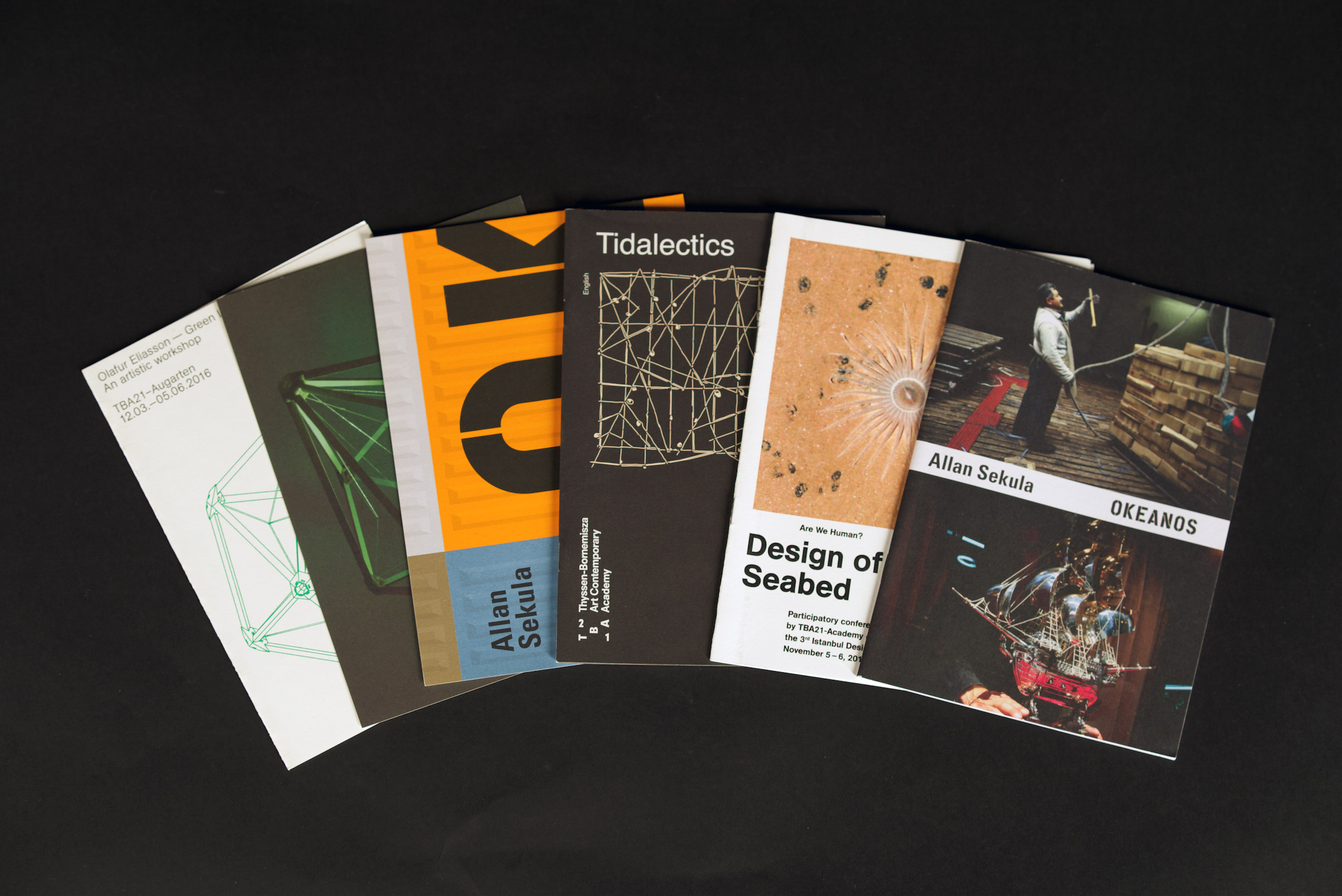
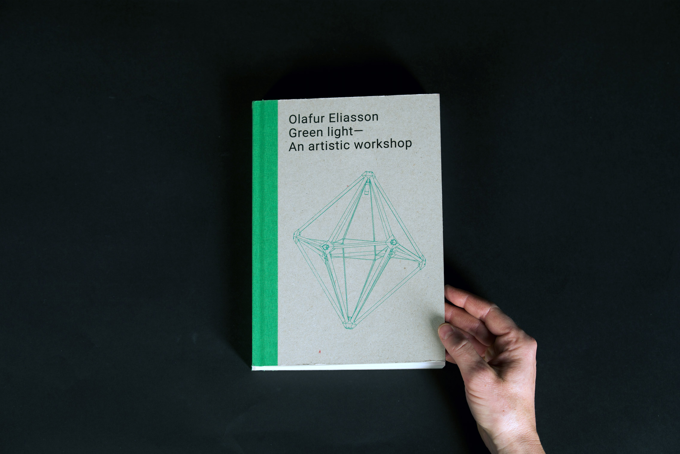
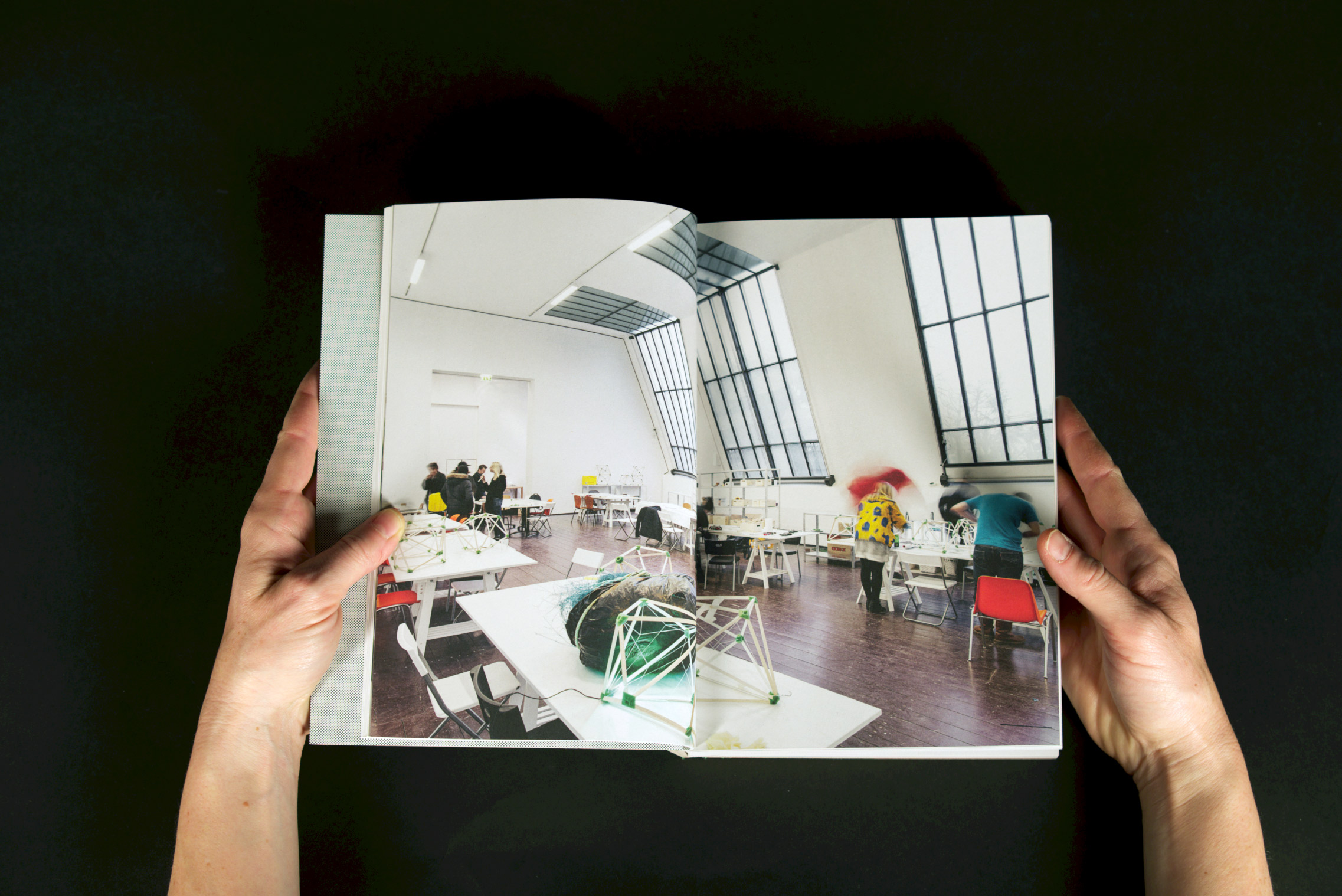
Books
TBA21, Thyssen-Bornemisza Art Contemporary
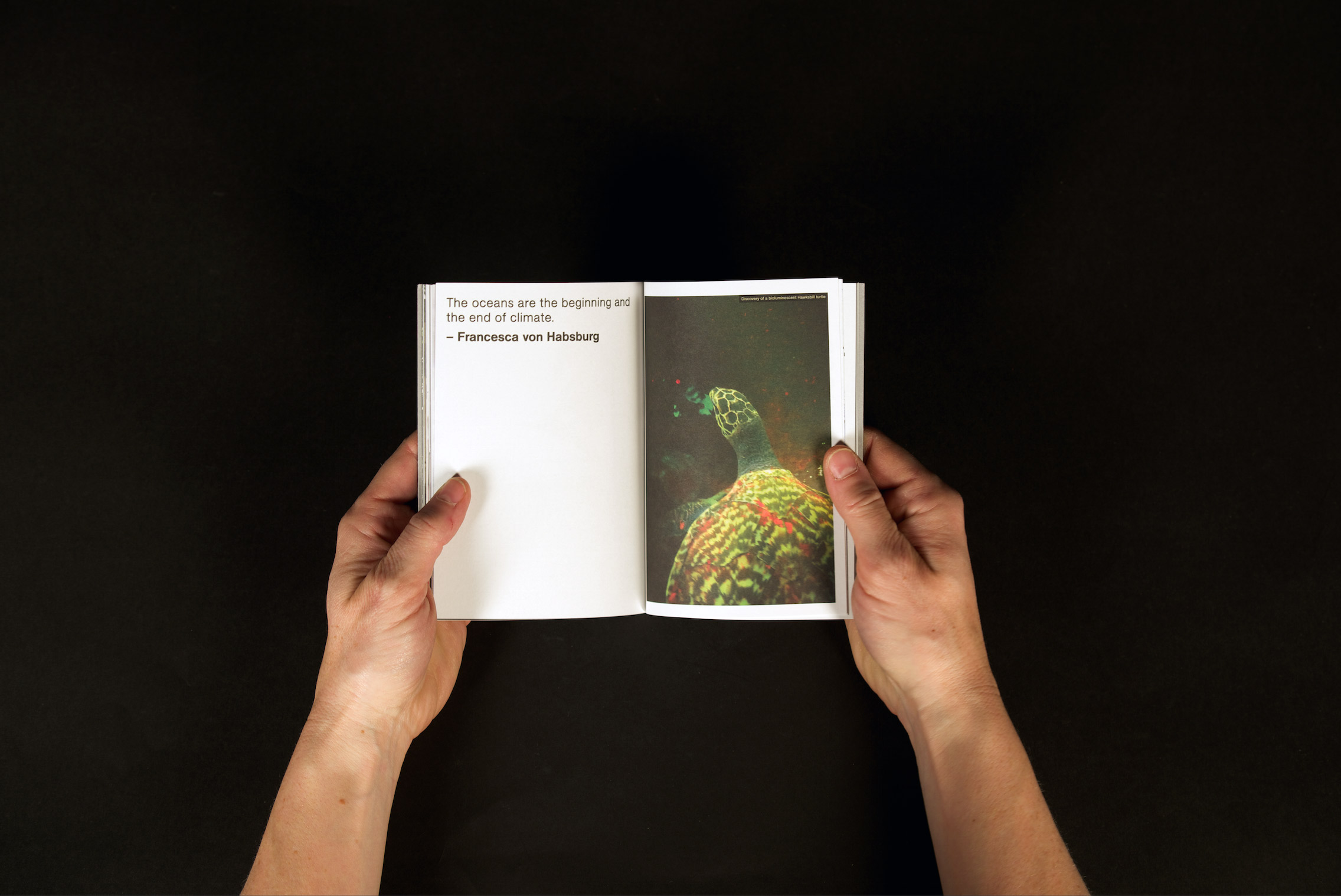
The Collection – Work in Progress
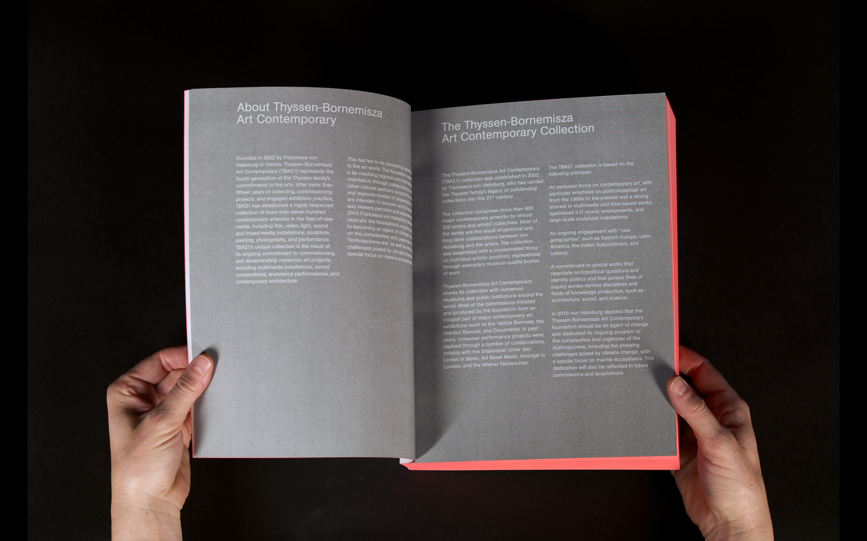
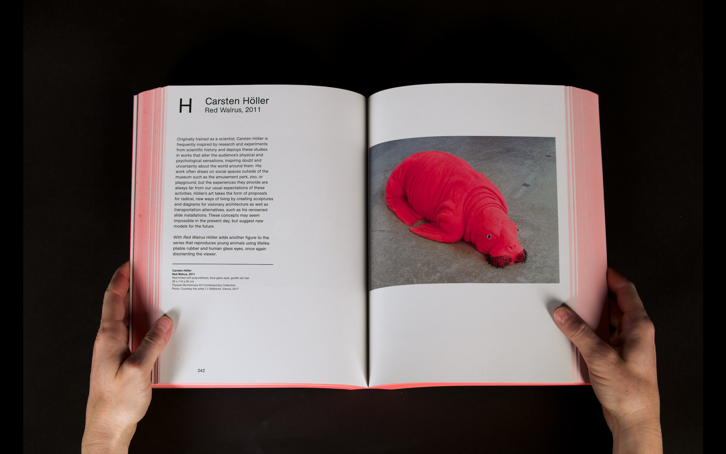
This book is representing TBA21 collection. The book is showcasing the result of the foundations ongoing commitment to commissioning and disseminating multidisciplinary art projects that defy traditional categorization, including large scale installations, sound compositions, endurance performances, and contemporary architecture. Since the foundation believes that art has the capacity to be a transformational force, it explores new modes of production and presentation that are intended to provoke and inspire change. In 2015 Francesca Thyssen-Bornemisza decided to dedicate the foundation´s unique program to becoming an agent of change by focusing on the complexities and urgencies of the age of the Anthropocene.
Catalogue of commissioned artworks
art direction, head of communication and events
www.tba21.org
art direction, head of communication and events
www.tba21.org


Books
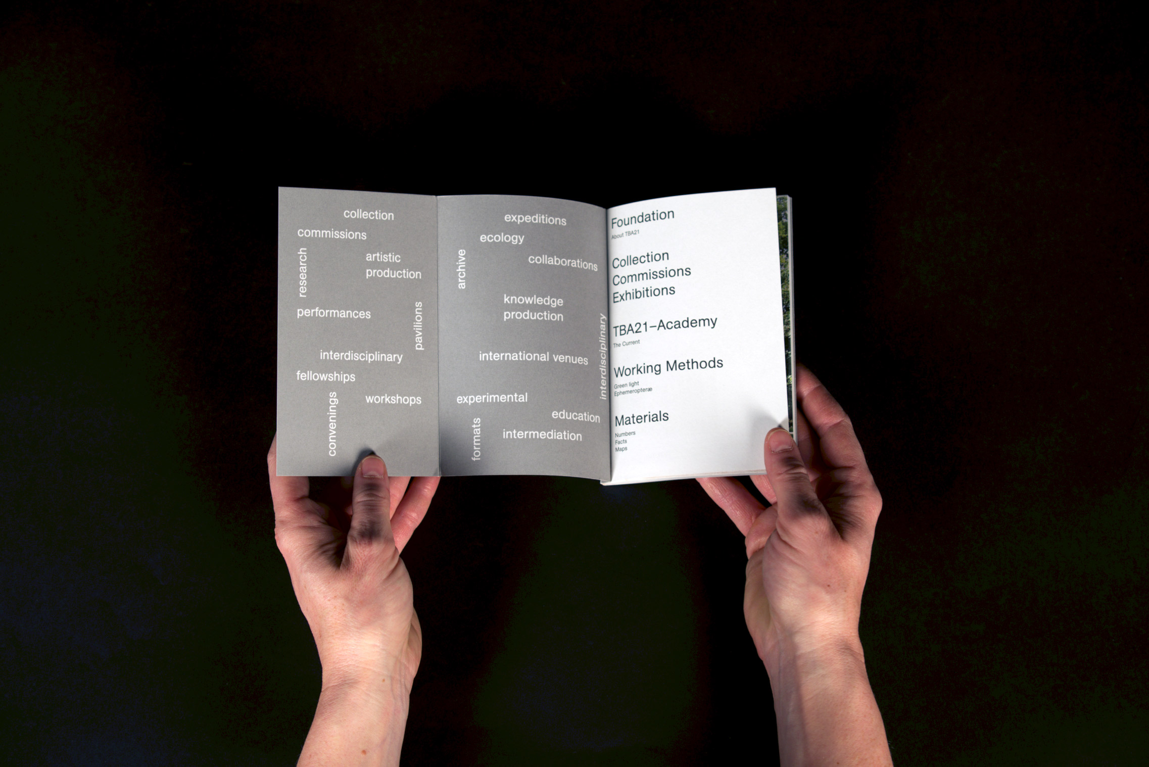
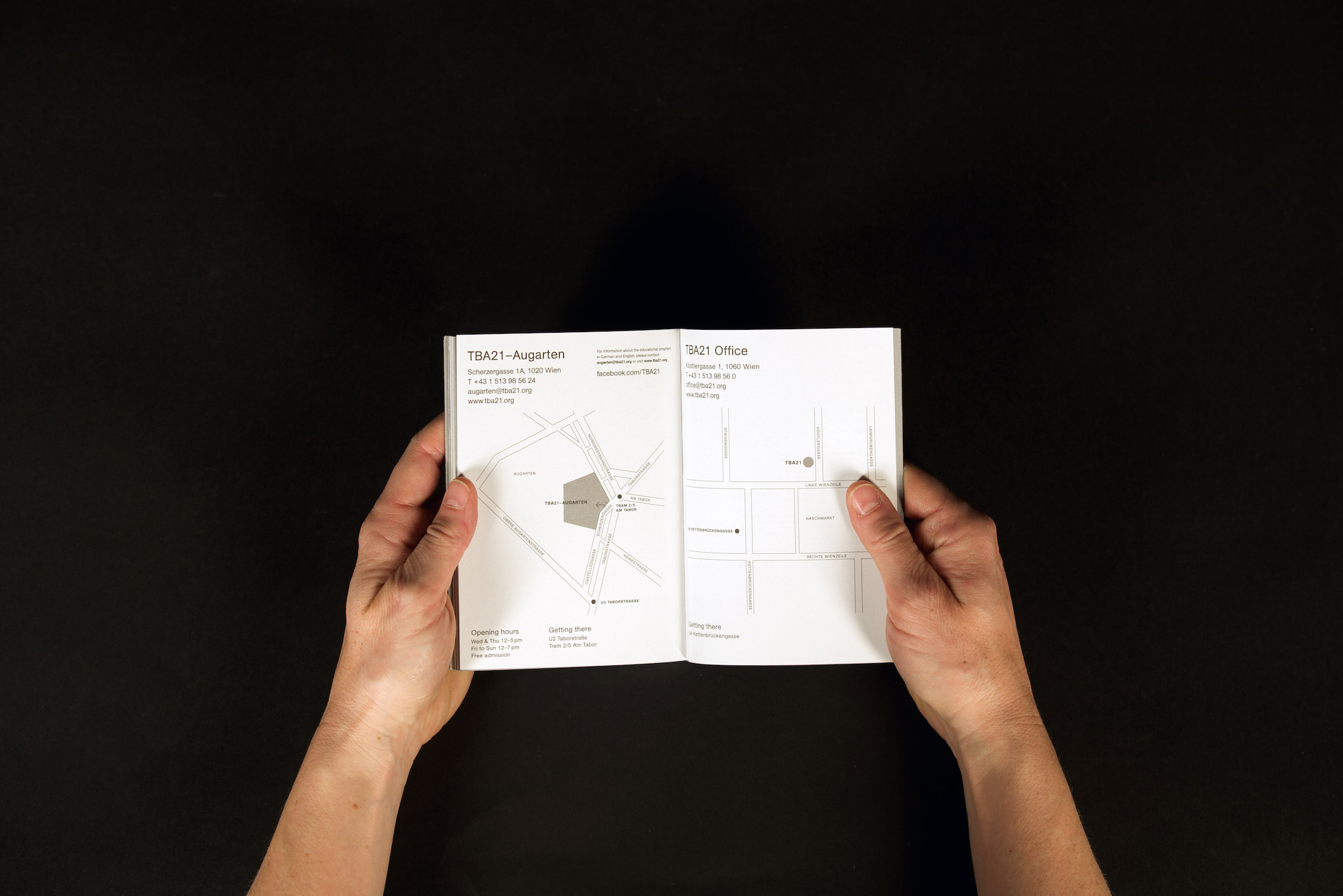
TBA21 – image brochure
with this brochure an overview of TBA21´s activities is created...
art direction, concept and design


Books
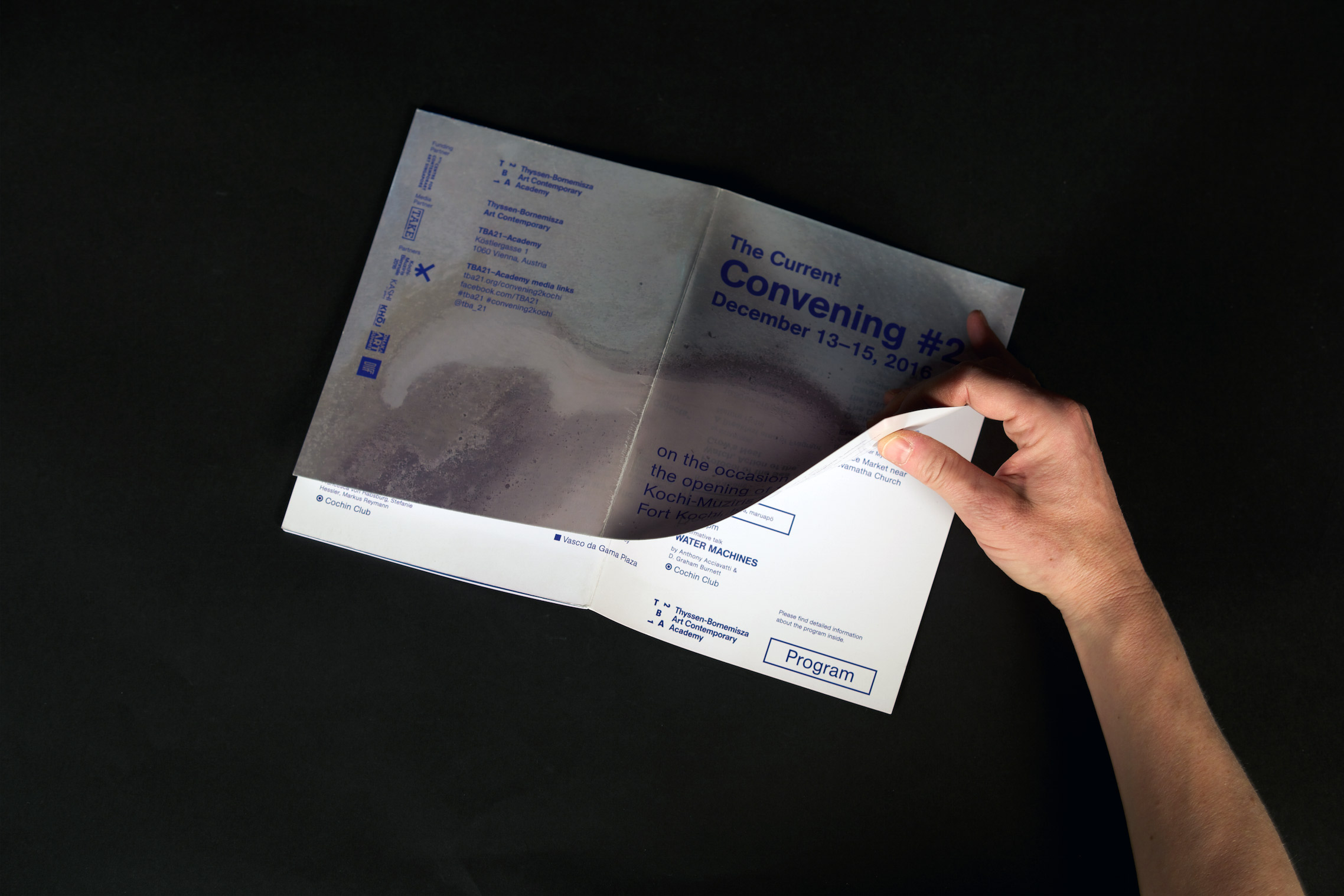
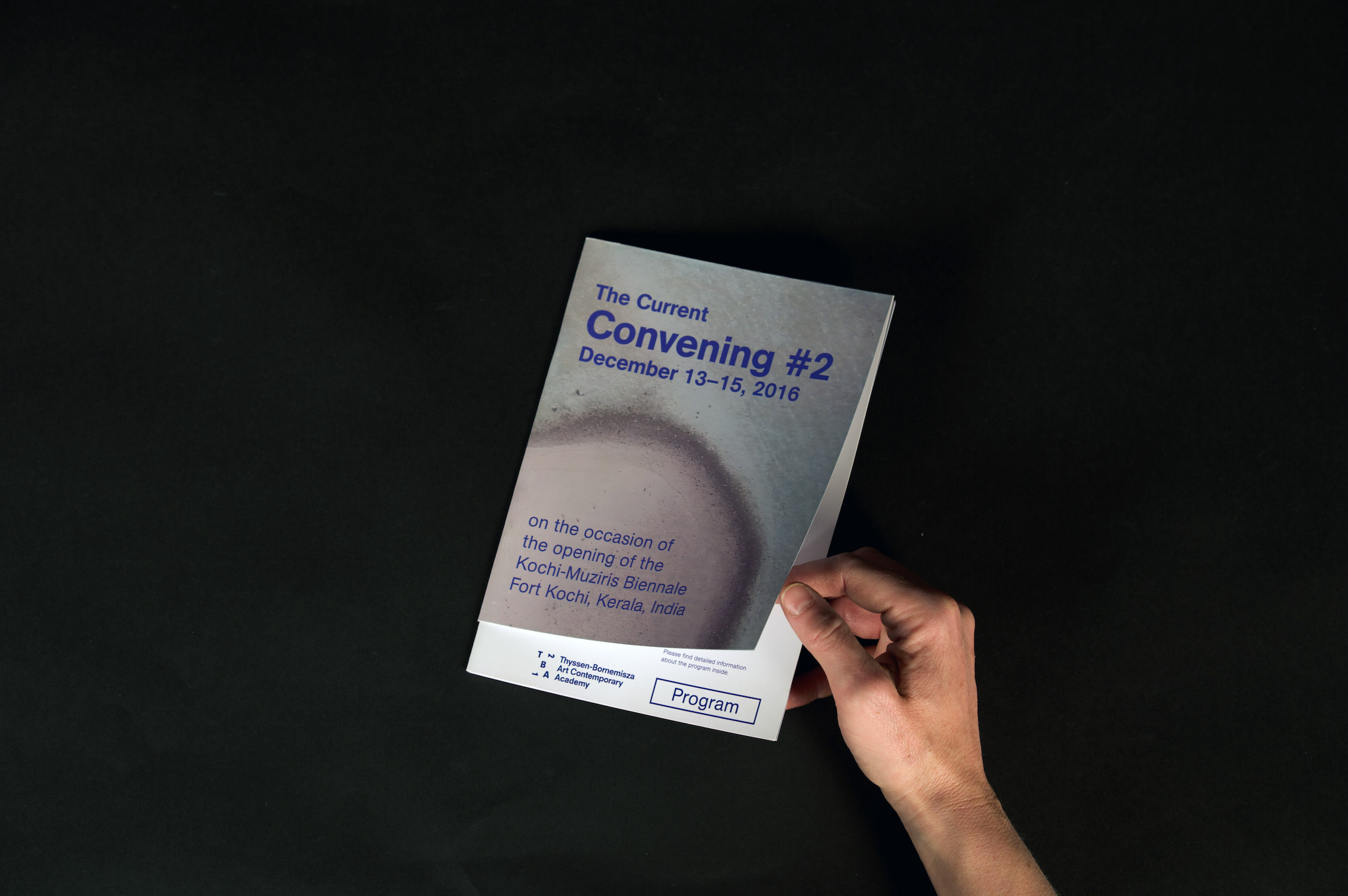
TBA21 Academy – Convening 2 – CI and brochure
TBA21´s Academy hold the Convening 2 at Kochi-Muzuris Biennale in India. In transdisciplinary formats artists, scientists and eco activists were showing their works, holding lectures and workshops.
art direction, concept and design


Books
TBA21 – diverse printed matters
here are other projects I was involved with at TBA21...
art direction, concept

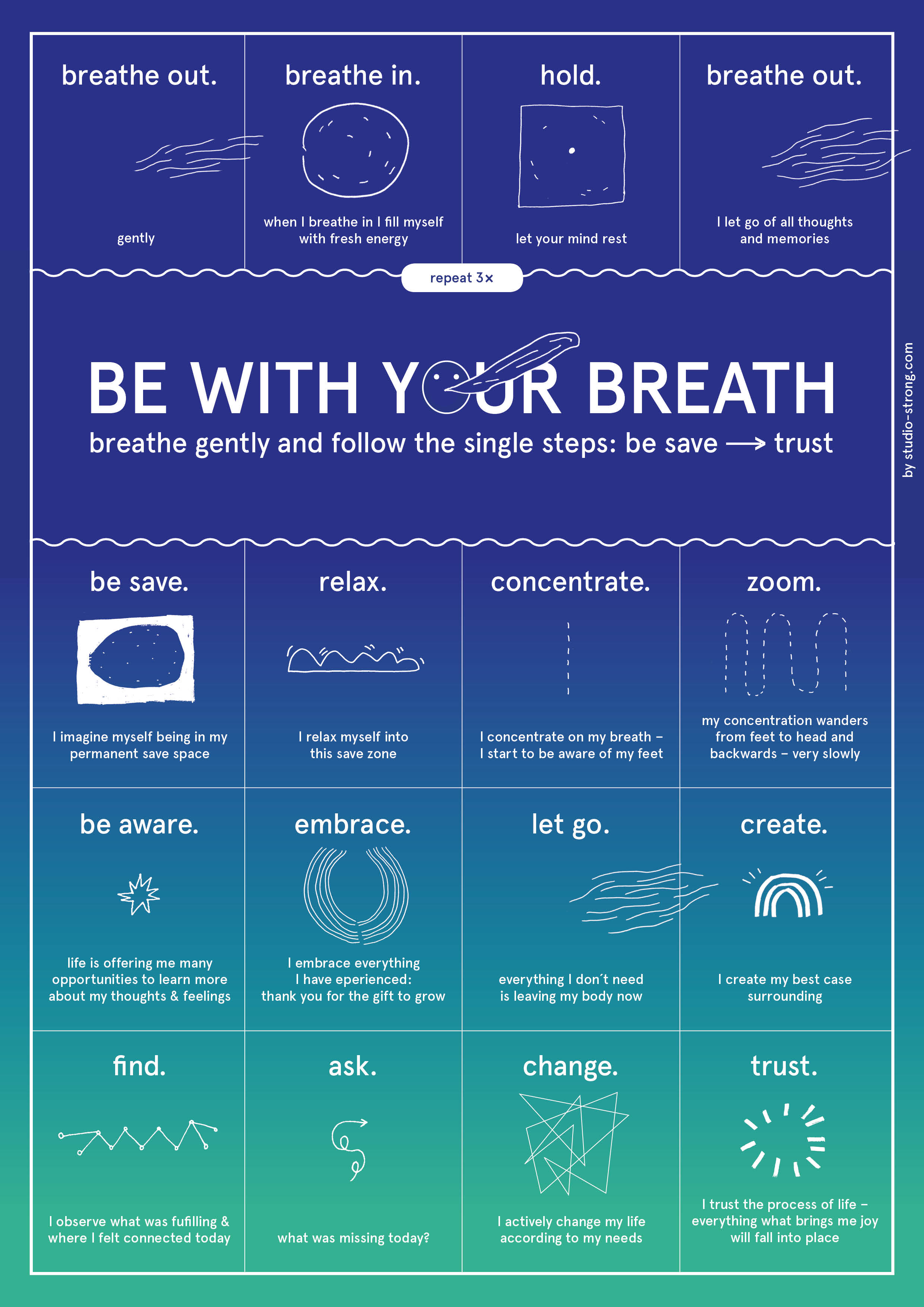
Poster
be with your breath
DinA2
more awareness in breathing. start your day with small tasks to be more relaxed, concentrated and greatful.
Books
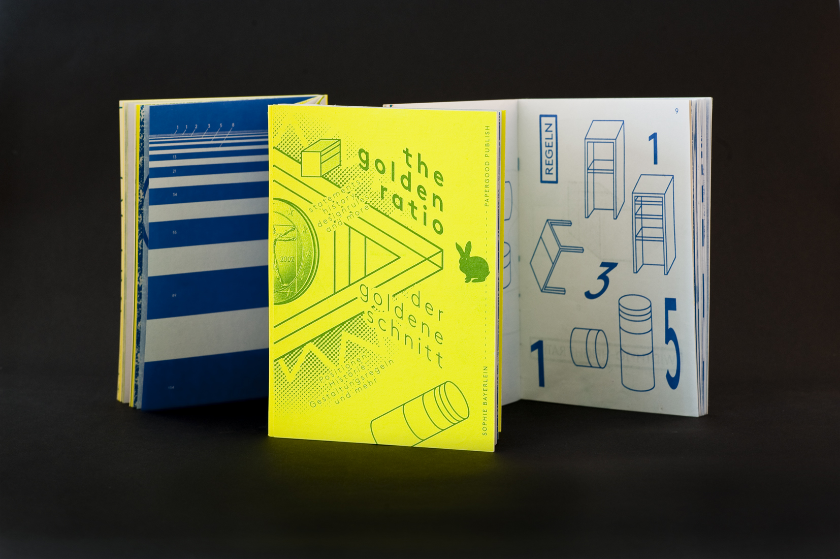
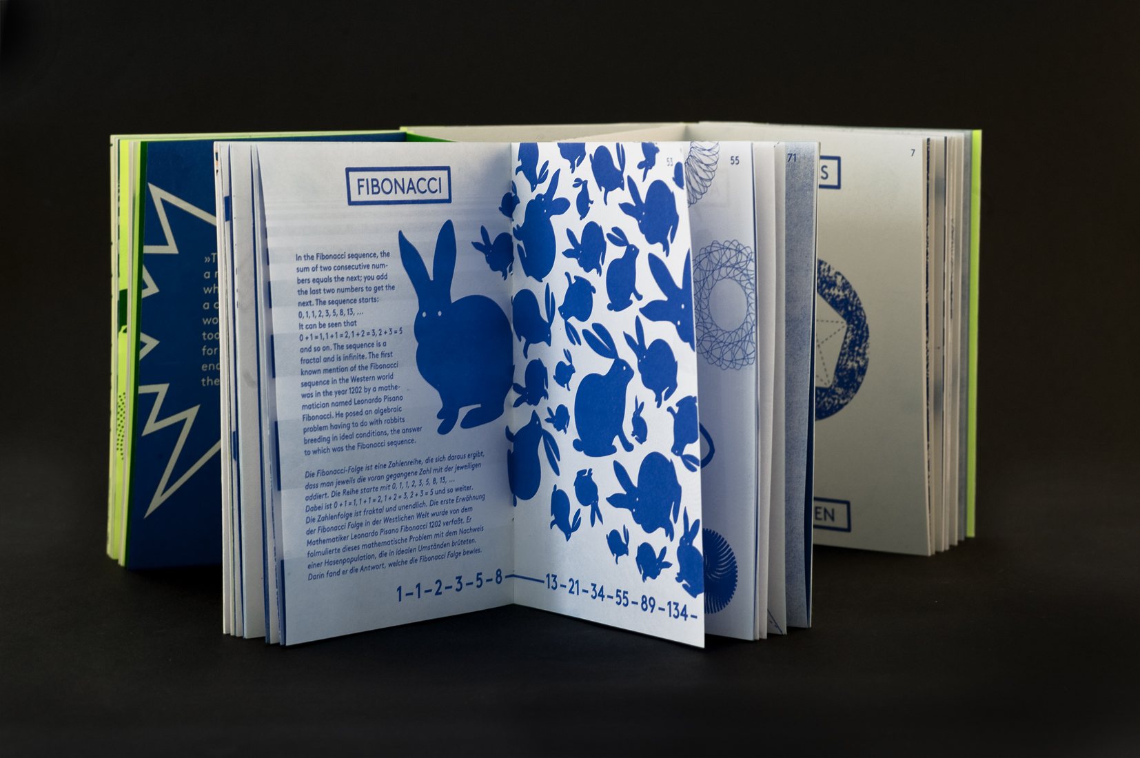
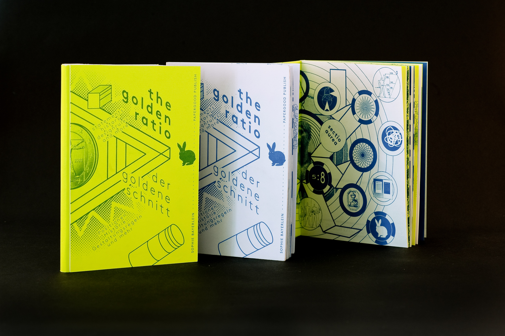
the golden ratio
perspectives on the golden ratio, more about the 5:8
from a historical, architecural and visual view
risograph print, small edition, hand crafted


Books
chaos computer club
portrait of the work of the german computer security specialists and keeper of digital rights: the chaos computer club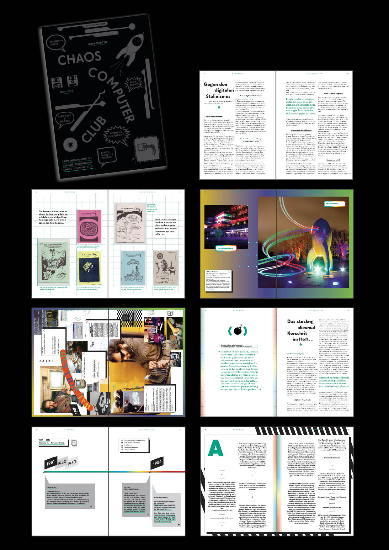
CI
Jardim Do Mira
The corporate identity for a permaculture and educational project in Portugal. The logo shows the hands on approach gives the association of a tree and a hand at the same time.

CI
Stark für das Klima
The corporate identity for Stark für das Klima is linking claims with illustration and combines a happy light visual language with serious topics.

CI
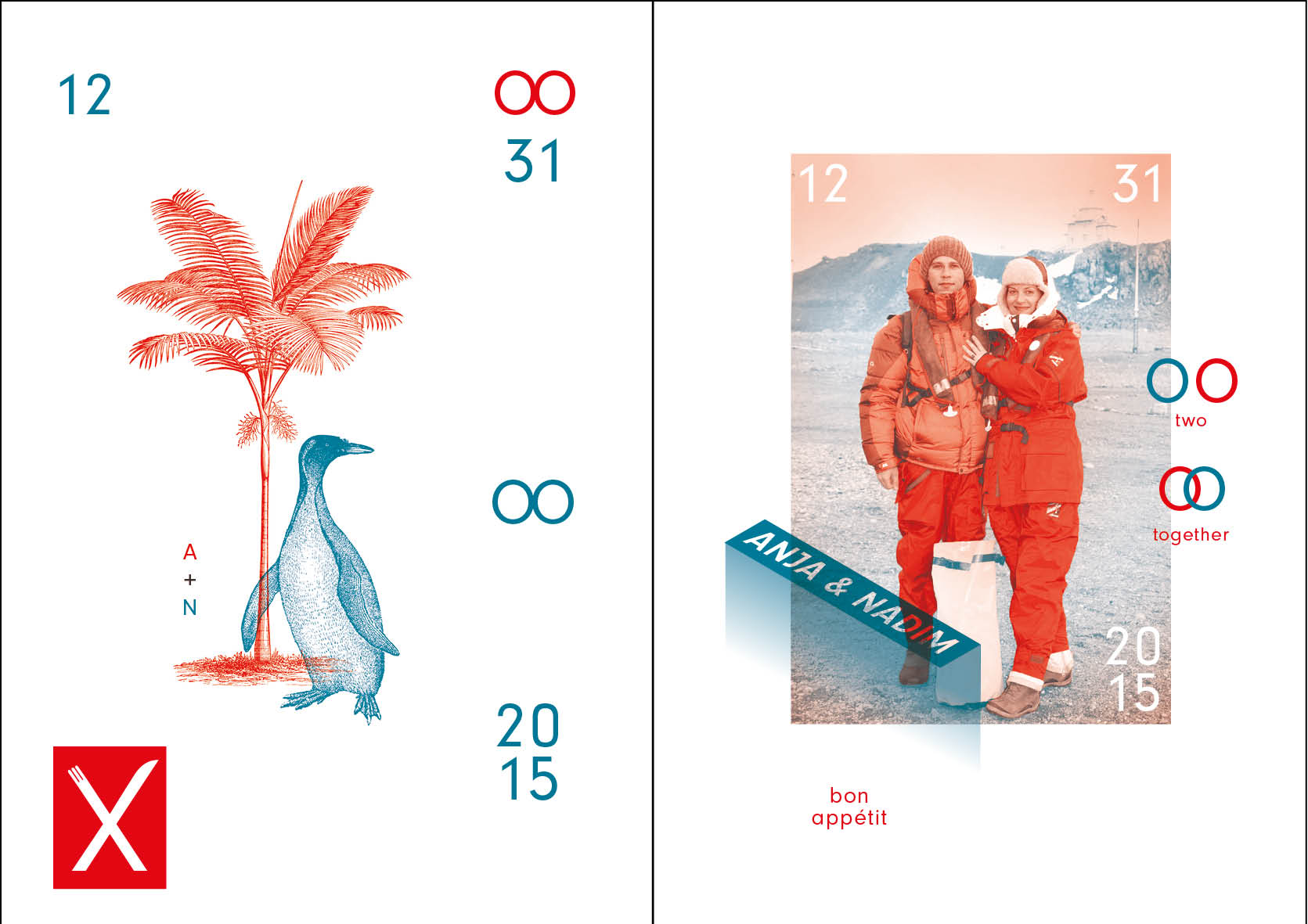
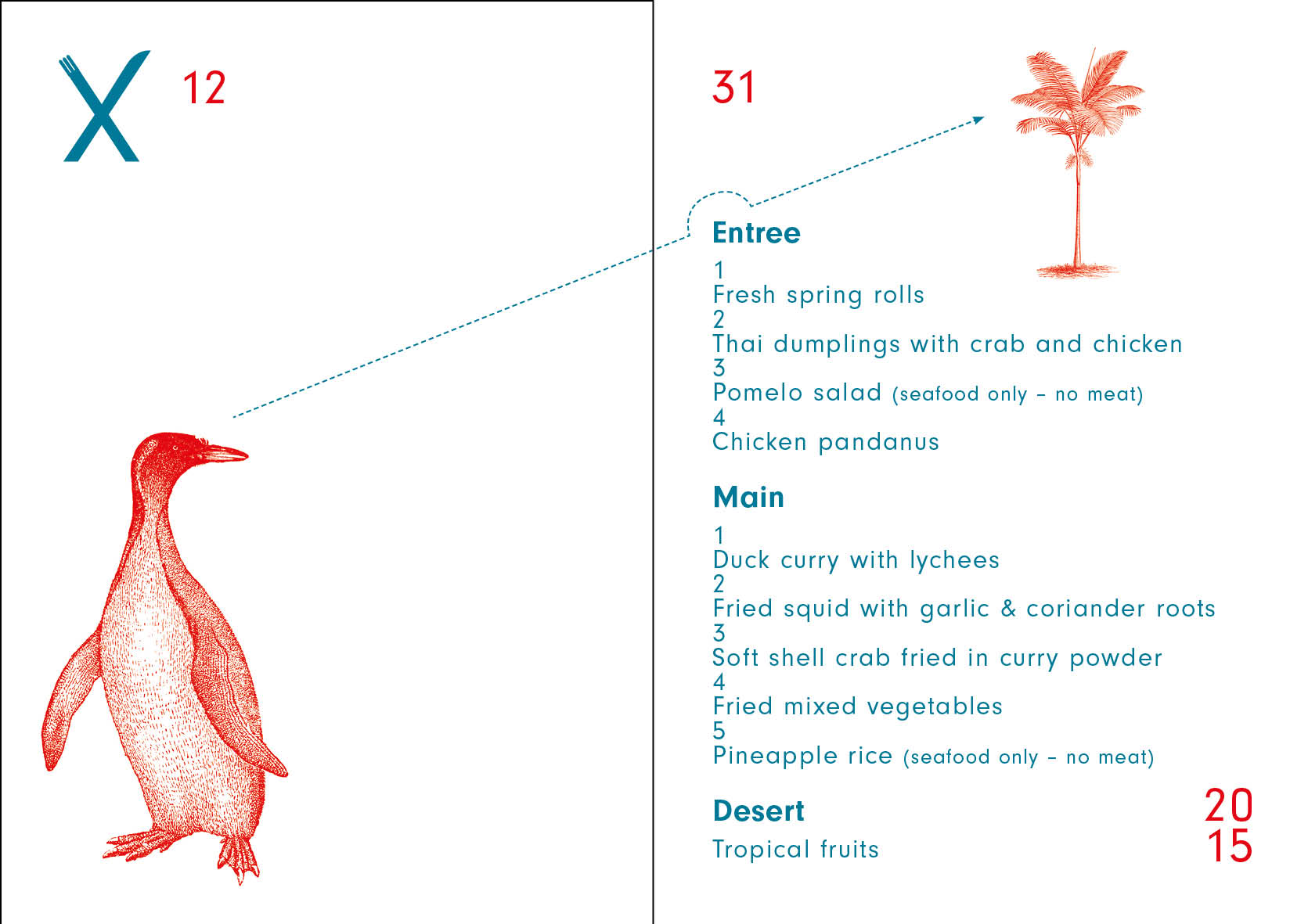
wedding card
The menue card for the wedding has a straight two colour layout for the unique printing process with a Risograph machine. The illustrations play with the background of the story of bide and groom.